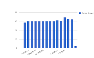
 This chart is a good representation because it is easy to read. All you have to do is follow the bars and the dates to locate where you when up or down. Besides that, it indicates rapidly which was your highest score and the date.
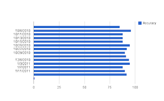
This Accuracy chart is similar to the one above,
 the only difference is that the bars are horizontal and the dates are on the side. This is also an easy chart to read because it is very organized and it is very hard to miss which days you did well and which ones you did not.
 This chart is one of the best because it has a shade of blue inside which gives it a little more color. Not only that but, the lines that curve are an indication of how well or how bad you did. It is similar to the others because it facilitates you to understand your scores.

Wow! You did everything that should be done.
ResponderEliminar